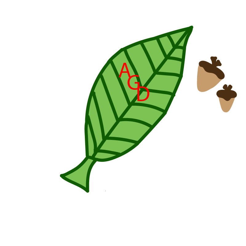
Staying with the theme of my blog being my sorority, I created a logo that goes with my sororities mascot. The Alpha Gamma Delta mascot is a squirrel, so I made a vector shape leaf and some acorns to represent a squirrel. I also added the AGD letters on top of the leaf. A logo is the embodiment of a brand and it incorporates visuals and colors and simple, to the point words. I enjoyed creating this image because it is something I am passionate about- my sorority. I used the color contrasting art principal of having 2 shades of green to make it look more realistic even though it has a cartoon vibe. I like that the mascot of AGD is a squirrel because we have a fun saying when we go out. We say go nuts and we call our house the nut house and I think that is cute and it’s important to be able to laugh at the fact that we have a weird mascot. Making this project I took my time creating my sketch, I made sure it was something I can actually create and wouldn’t be too hard but would still be a fun challenge. From there I made my draft to match that using a variety of tools. These are ones learned to use in the past including the paint brush tool, the eraser tool, the color fill and line segment. I made the AGD red because the colors of our chapter are red, green and buff so I felt like the red added a good contrast and represented my chapter well. I think that this logo could be used if it was made big on a billboard and also it would work if it was made small as like a sticker or keychain and that is an important aspect of a logo.

Great job on your project! I really like your creativity and simplicity with this logo. It would be a fun image to put on things you want to show your letters on or decorate with. It’s very fun but also clear what you are trying to communicate. One suggestion I have is to try and make a few of the lines a little cleaner on the edges so they look more like one cohesive picture. Another suggestion I have is to maybe change the color of the letters a little bit, or outline them somehow so they are a little bit easier to say. They kind of blend in to the background a bit.
LikeLike